A Boeing 747-400 wearing the Chelsea Rose livery taxis past two other 747s in the Chatham Dockyard livery, c. 2002
In 1997 British Airways (BA) adopted a new livery. One part of this was a newly stylised version of the British Airways "Speedbird" logo, the "Speedmarque", but the major change was the introduction of tail-fin art. Also known as the Utopia, World Tails and world image tailfins, they used art and designs from international artists and other sources to represent communities in countries served by BA's route network. The signature of the artist was carried near the design on the tail.
The new corporate logo was created by the London-based design agency Newell & Sorrell, who also oversaw the implementation of the tailfin designs.
The German designs refer to the BA subsidiary Deutsche BA, the French designs refer to the BA subsidiary Air Liberté, and the Australian designs refer to BA's alliance with Qantas.
History
Launch and reception
Our existing livery has served us well. It helped transform our company in preparation for privatisation. Now all of our research is telling us we must change again, to prepare for the exciting new era that the new millennium will bring. ... The identity we unveil publicly today is that of a global, caring company, more modern, more open, more cosmopolitan, but proud to be based in Britain.
— Bob Ayling, Why we are changing our identity, speech of 10 June 1997[1]
The adoption of this aircraft livery was seen as a move away from the traditional British image of the carrier. BA claimed that the previous Landor Associates scheme carried an air of arrogance and detachment,[2][3] and insisted that the new tailfins were popular with international travelers. In addition to the new tail art, the crest and motto "To Fly. To Serve." were dropped from the livery to make the airline appear more "global and caring."[2] In his speech at the launch, Chief Executive Robert Ayling declared that BA needed "a corporate identity that will enable [it] to become not just a UK carrier, but a global airline that is based in Britain" and the airline should better reflect the international image of the UK as "friendly, diverse and open to other cultures."[1] The total cost of the rebranding was estimated at £60 million,[4] of which £2m was paid to artists and the Newell and Sorrell design firm.[2]
The initial rollout consisted of 15 distinct tail art designs.[5]Quentin Newark later called the initiative "incredibly brave" and praised the work of Newell and Sorrell as "expressive [and] gleeful".[6]
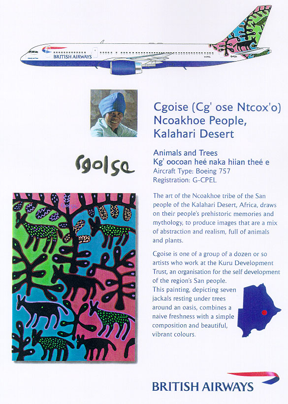
Former Prime Minister Margaret Thatcher covered the tailfin of a model 747 painted with Animals and Trees like this one.
However, they were unpopular with many traditionalists in the UK, despite nine of the designs being inspired by either England, Scotland or Wales. Flight crews derided the new designs as "Air Zulu."[7]Jonathan Glancey criticized the Utopia project as "muddle-headed and messy - ethnic designs turned into the equivalent of doll's-house wallpaper, things applied but not belonging", failing to give the airline a cohesive identity. Glancey added the ethnic designs "had the net effect of trivializing art and design from around the world", comparing their display to the patronizing attitude of the colonial era British Empire.[8] Former Prime Minister Margaret Thatcher showed her displeasure at the designs by covering one of the new tailfins (Animals and Trees) on a model 747 with tissue paper. She declared, "We fly the British flag, not these awful things" in 1997.[9][10] Thatcher also indicated with these fins the airline would lose its identity.[11][12] Amongst BA passengers, the highest rate of disapproval for the new designs was registered by business travelers between North America and Great Britain.[7]
Virgin Atlantic took advantage of the controversy by applying a Union flag scheme to the front end of its aircraft.[13] In their own 1999 relaunch, the flag was also applied to the vertical winglets of Virgin Atlantic's aircraft.[14][15]
Review of use
While the majority of the designs were applied to a variety of aircraft models, one scheme (the stylised version of the Chatham Dockyard Union Flag) was used on Concorde only. By 1999, BA had repainted around half its fleet (170 aircraft) in its new colours but then Chief Executive, Robert Ayling, announced a review of this process. The aircraft already repainted would keep the new designs, but the remainder of the fleet (still showing the Landor design) would receive a variant of Concorde's Union Flag design.[16] The announcement was timed to divert some attention from Virgin's relaunch. Chris Holt, the head of design management at BA who led the Utopia Project, resigned in October 1999.[4]
G-BNLH with Wings tail (1999)
A single 747-400 leased from British Airways to Qantas in 2000, registered as VH-NLH whilst operating in Australia (formerly G-BNLH), wore a hybrid livery complete with the Denmark Wings tail design. Under service with Qantas, the British Airways titles were removed and replaced with Qantas' own, but the remainder of the livery was left unchanged.[17]
In May 2001 the new Chief Executive, Rod Eddington, announced the entire fleet would receive the new Union flag livery.[7] The ethnic images would also be removed from baggage tags, menus, signage boarding passes and all company materials. Eddington argued that while an attempt to increase the airline's appeal was not a bad thing, the exercise had hurt the image of the carrier among its core customers – those that are attracted by the British identity. Eddington's opinions were echoed by Adam Hill, founder and partner of the advertising agency Designate, who stated that "name and logo are just small parts of the puzzle: to customers, the pride and heritage of this very British brand is what appeals, and swapping that out in order to appear modern and multicultural resulted in the very essence of the brand being diluted."[18]
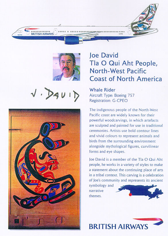
G-MEDA with Whale Rider (2001)
The final aircraft with a "Utopia" tail (Whale Rider) was retired in 2006, an Airbus A320-200 registered G-MEDA. Two Bombardier Dash 8 aircraft continued to operate with "Utopia" tails (G-BRYU, Benyhone Tartan; G-BRYV, Colum) for regional service until 2006, when both aircraft entered service for other airlines.[12]
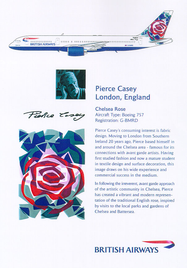
Representation of the English rose, based on visits by Casey to parks and gardens in Chelsea and Battersea. Carried by both 'British Asia Airways' Boeing 747-436s whilst in service with those titles.[30]
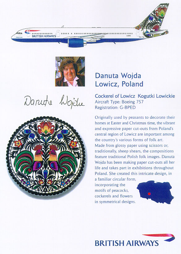
Sometimes spelled Koguty Lowickie, meaning Cockerel of Lowicz. Based on paper cut-out of cockerels, peacocks and flower.[37] Unique variant "Flowers of Mazowsze" applied to G-OGBC
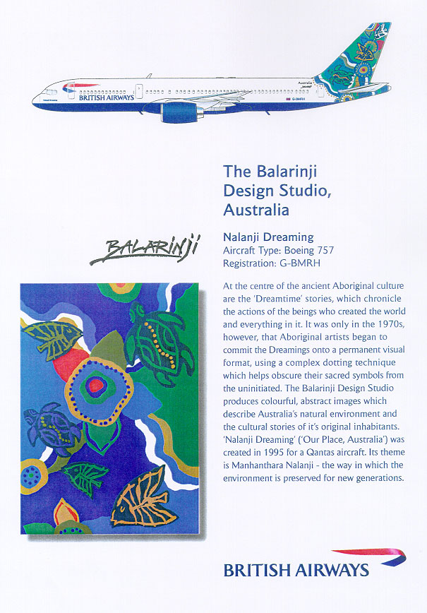
Aboriginal art, originally designed in 1995 for Qantas and painted on a B747-300 aircraft (VH-EBU). Nalanji means "our place".[38][39] Environmental preservation theme.[40]
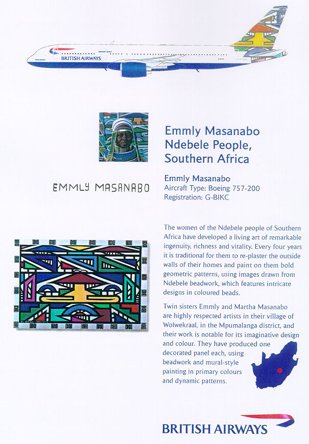
Officially named Emmly Masanabo after the artist, who is of the Ndebele people. Based on a panel decorated with beads and mural-style painting; a similar panel was produced by the artist's twin sister Martha, commonly known as Ndebele Martha.[41]
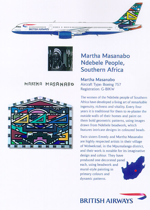
Officially named Martha Masanabo after the artist, who is of the Ndebele people. Based on a panel decorated with beads and mural-style painting; a similar panel was produced by the artist's twin sister Emmly, commonly known as Ndebele Emmly.[42]
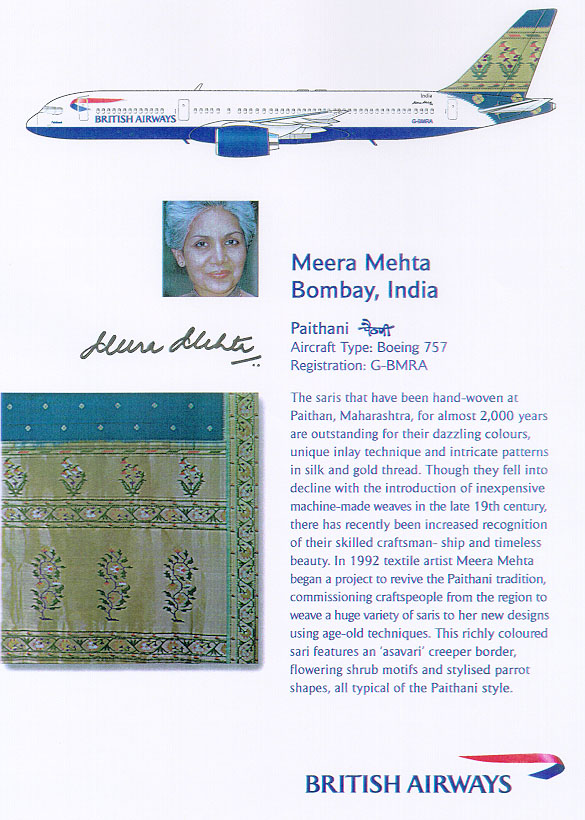
Based on a sari designed by Mehta using traditional motifs from the textile industry in Paithan. Features 'asavari' creeper border with flowering shrubs and parrots.[43]
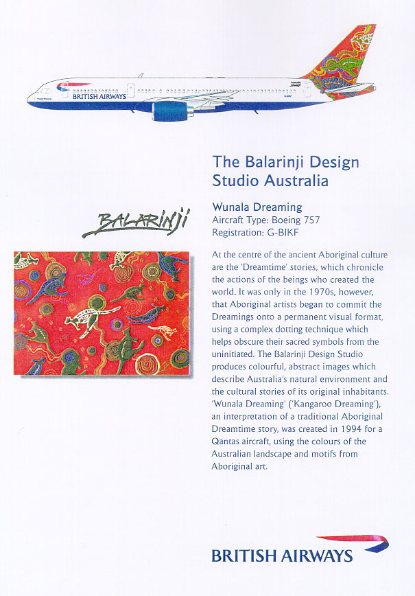
Like Nalanji Dreaming, this livery was designed for Qantas in 1994 and appeared on two B747-400 aircraft: VH-OJB and VH-OEJ. Based on an original painting inspired by "the natural colors of Australia" and executed by the Yanyuwa people.[38][39] The title translates to "Kangaroo Dreaming".[52]


.jpg)

.jpg)
.jpg)
.jpg)
_(cropped).jpg)
_(cropped).jpg)
_(cropped).jpg)
_(cropped).jpg)
_(cropped).jpg)
.jpg)
_(cropped).jpg)
_(cropped).jpg)
_MAN_28JUN02_(8231164019)_(cropped).jpg)
_(cropped).jpg)
.jpg)
.jpg)
_(cropped).jpg)
_(cropped).jpg)
_(cropped).jpg)
.jpg)
_MAN_30MAR02_(8131592356)_(cropped).jpg)
_(cropped).jpg)
_MAN_01MAY02_(8183450594)_(cropped).jpg)
_(cropped).jpg)
_MAN_28NOV99_(6602563669)_(cropped).jpg)
.jpg)
.jpg)
_(cropped).jpg)
_(cropped).jpg)
.jpg)
_(cropped).jpg)
.jpg)
_(cropped).jpg)
_(cropped).jpg)
_(cropped).jpg)
.jpg)
_(16818529391).jpg)
.jpg)

.jpg)
.jpg)


.jpg)
.jpg)

.jpg)
.jpg)
_British_Airways._(8850861916).jpg)
.jpg)
.jpg)


.jpg)

.jpg)
.jpg)
.jpg)

.jpg)
.jpg)
.jpg)

.jpg)
.jpg)


.jpg)
_DUS_03AUG03_(8648158420).jpg)
.jpg)
_JP6138551.jpg)
.jpg)
.jpg)
.jpg)
.jpg)


.jpg)

_MAN_28NOV99_(6602563669).jpg)
_MAN_29MAR02_(7157881612).jpg)
.jpg)
.jpg)

_MAN_27APR03_(8380221952).jpg)
_LHR_11AUG99_(6628805571).jpg)
!["[untitled]"](https://web.archive.org/web/20190131151334/https://www.lockonaviation.net/images/info/infodownside.jpg)
!["[untitled]"](https://web.archive.org/web/20190131170937/https://www.lockonaviation.net/images/info/infobauhaus.jpg)
![[1]](http://www.brinkley.cc/PhotoData/GJ/GJ257/gj257_a.jpg)
![[2]](http://www.brinkley.cc/PhotoData/GJ/GJ015/gj015_a.jpg)
![[3]](http://www.brinkley.cc/PhotoData/GJ/GJ015HKG/gj015hkg_e.jpg)